Mood Board
Mind Map
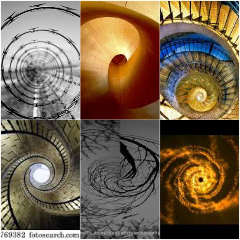
Simon Painter


In my opinion my favourite picture is the picture of the right. This is because of the colour and the contrast of the colour. Different colours makes different moods of the picture. The green dot in the middle makes it look like an eye. This picture is called a dragon eye because of the colours and the mood shown in the picture. This gives the pictures a different mood and is very mysterious and good theme. This is a good picture because it is taken from a closer distance than the other picture. This adds a different style to the other pictures as it changes the mood and the viewers perspective of the picture. Similar photoshop techniques were used for all the pictures but the way lines are shaped in the picture, making a half spiral. The lines look planned but spontaneous at the same time.
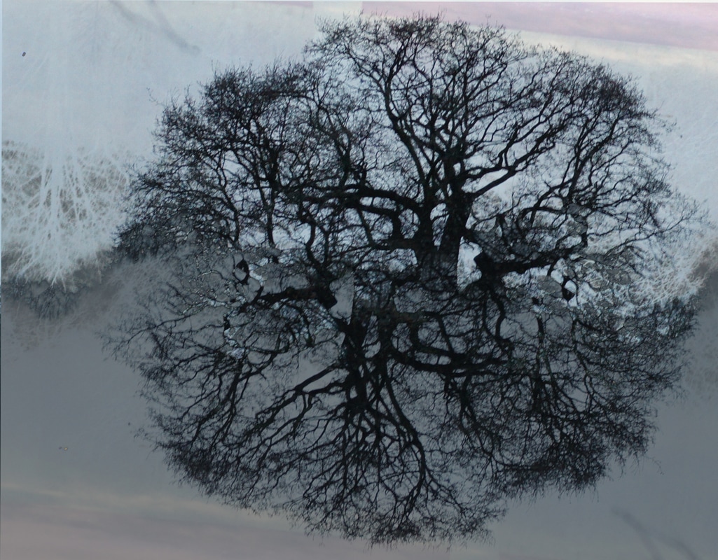
The picture looks like it's blurred and hallucinated and therefore the picture looks a small bit distorted. Therefore the picture looks lighter on the outside of the picture. the content of the picture is a tree and branches. They have made a simple object look lots more complicated. The things I like about this picture is the simplicity and the shape the tree was made into. The slight discolouration between the top of the picture and bottom of the picture. Each of the layers which are circles in my opinion represent a ring on a tree branch.
The centre picture in my opinion is completely unique compared to the other pictures. this is because the message of the picture is going from darker to lighter. The soft colours on the outside of the picture makes the shift up to the harsh gold colours more appealing. The middle of the picture is a lighter gold. The contrasts of the picture and causes the viewers of the picture look further back as the circle gets bigger. This makes the pictures getting further back from each other.
Spiral Photography


This is similar to the other photos, however the spiral is more seen and is in mid air. However I prefer the the person but these photos tell a different story. This looks more string like and the colour of the picture and the created depth of field on the string. This is shown by the road and the shape of the string that is imitating the road. The background colour and the pictures of the in the background colours and the shape of the background.
The shape of the middle picture is distracting and taking there attention away from the main focus and the gold water and the gold string. The whole picture stops the viewer from seeing the background so the viewer doesn't see the background. This is why I don't like this picture as the spiral is to close up and doesn't give any story for the the viewer to uncover
The shadow of the picture and the gold in between the picture. This makes the picture look more effective, the contrast between all of the three colours and the three spirals merge in the middle. And the opacity of the picture decreases in the middle. This makes the middle more of the main focus of the picture overlaps with the picture and causes illusion idea . This therefore makes the middle oft the picture or the main focus of the picture look more in focus.
Photoshoot 1
Edited pictures


This is a first attempt at spiral photography, I would like to make most of the pictures around nature and have a different effect on the word spiral photography. As my work is similar to Simon Painter but is not the same. Its similar because of the shape and the subject of the picture. I like these pictures because of the different shapes and colours of the pictures. The subject form both the pictures are the sae but the pictures look different because of the way they have been rotated. I like the second picture more because of the way its merged into one picture.
In the future the way I will improve the pictures are is making the rotations more crisp and make it more vivid for the audience. If you add new layer styles it adds a different effect on the background. The first picture on the left is the lighten layer style. This makes the background fit in more than other effects. My favourite picture is the one on the right as the background is blurred and fits in much better than before.
In the future the way I will improve the pictures are is making the rotations more crisp and make it more vivid for the audience. If you add new layer styles it adds a different effect on the background. The first picture on the left is the lighten layer style. This makes the background fit in more than other effects. My favourite picture is the one on the right as the background is blurred and fits in much better than before.
Photoshop tutorial


The first step is the one on the left this is to duplicate layer. Then the second step explains that you click on edit transform and then rotate. You change to opacity of the layer and rotate as much as you want to get a different effect. In the picture above you change the opacity to around 50% and rotate the picture 90 degrees. This varies from picture to picture.
Photoshoot 2
Best photos


The pictures above are of the same object but the pictures are similar but different. The picture on the left has different amount of layers than the picture on the right. This is shown by the different layout of the tree. the lines which are the branches of the trees. This is better try than the first photoshoot as it is more clear and is a closer example to Simon Painter photograph. T The way to improve the picture is to make more blurred and more of a spiral effect.
Layer Styles on Photoshoot 2


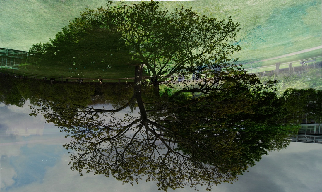
The layer stiles add a different effect on the pictures , the picture on the left makes the image look more transparent than the original and makes the colour look more dull. Changes the background colour to a grey. This changes the whole mood of the picture. This makes the picture look more gloomy. Th picture on the right is more transparent but doesn't take away the colour of the sky, there is a slight grey in the picture. Both pictures have been warped together slightly, this makes the position of the trees different. In my opinion I think that the picture on the right is better.
Photoshoot 3
Best Photos


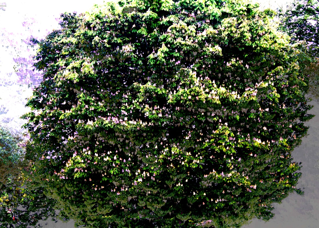
The pictures on the right and the left are the same. However the outcome is completely different. This is because the opacity used and the layer styles used gave a completely different effect. The picture on the left expresses more nature effect and expresses the colour in the tree and the background more clearly and subtly. The picture on the right gives a completely different effect making the background a much cold blue makes the focus of the picture stand out more. The green in the tree is much less sharp, however I like it more than the picture on the lest, of the contrast of the colours and the way both the trees bond together. The picture in the middle is of a different tree and the style and the opacity is completely different, it looks more like a see through shadow than a reflection.
Photoshoot 4


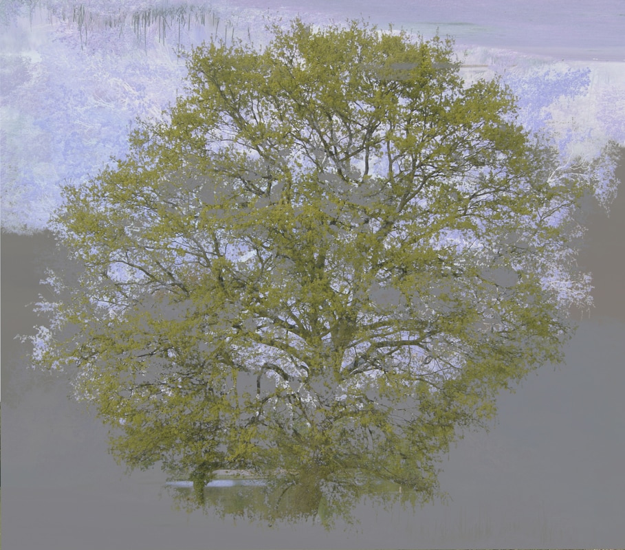
The form and the content are similar because the subject of the picture are the same. But the photoshoot was not as effective as the other pictures. This is because there are to many leaves. Therefore it looses the abstract effect of the other pictures. This is because the background is much more clear. I like the picture on the right much better as the picture has different colours in the middle of the tree to make the contrast better. The picture on the left is a different colour to the other picture. I also like the different contrasts of colour. the spread of the focus therefore makes the picture look more appealing.
Final Pieces